
Tech
How To Design Website Navigation That Feels Clear, Fast, And Easy To Use

Key Takeaways
- Use familiar labels that clearly describe what each section contains.
- Keep primary navigation focused on the pages visitors need most.
- Design mobile menus as a full experience, not a compressed desktop menu.
- Support touch, keyboard, screen reader, and visual accessibility needs.
- Use hierarchy to guide attention toward the most important actions.
- Test the menu structure with real users, then improve it using evidence.
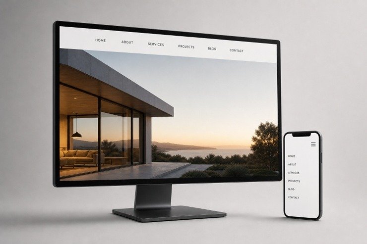
A polished website can still frustrate visitors if they cannot quickly figure out where to go next. Effective navigation removes uncertainty, helps people understand what a business offers, and makes important tasks feel simple. Reviewing strong nav bar patterns can be useful for inspiration, but the best structure always begins with the needs of the people using the site.
In 2026, visitors may arrive from a phone, tablet, laptop, or large desktop display, often with little patience for confusing labels or crowded menus. Clear navigation supports trust, content discovery, conversions, support, and return visits because it gives people a predictable path through the experience.
Why Website Navigation Matters
Navigation is more than a row of links at the top of a page. It is the system that tells visitors what exists, where they are, and how to move forward. When menus are clear, people can compare services, find answers, contact the right team, or complete a purchase without stopping to decode the interface. When they are unclear, users may leave before discovering the value of the site.
Modern navigation must also work across different contexts. A visitor on a small screen may be using one hand, while another may be navigating by keyboard or screen reader. The goal is not to make every link visible at once. The goal is to make the next useful choice easy to identify.
Start With User Goals And Content Needs
Before selecting a menu style, identify the tasks visitors are trying to complete. Internal departments, campaign names, and company jargon rarely make good navigation labels unless customers already use those terms. A strong menu reflects user intent instead.
A Practical Planning Process
- List the pages that matter most to customers, prospects, applicants, or members.
- Group those pages by the reason someone would need them.
- Remove duplicate routes and pages that offer little value.
- Rank each group by demand, business importance, and urgency.
- Use the strongest groups as primary menu items.
Ask simple questions during this process: What does a first-time visitor want to know? Which pages help them compare options? Where would they look for pricing, support, locations, or contact details? The answers should shape the structure before visual design begins.
Choose Clear Labels That Reduce Guesswork
Visitors should be able to predict what appears after they select a link. Short, familiar labels usually outperform clever phrases because they lower the mental effort required to browse. “Services,” “Products,” “Pricing,” “Resources,” and “Contact” are useful when they accurately describe the destination.
Keep labels consistent across the website and align them with page titles whenever possible. For example, a menu item called “Resources” should not lead to a page titled “Knowledge Center” unless both names are clearly explained. Avoid vague choices such as “Explore,” “Discover,” or “Our World” when a more direct term would tell visitors what they will find.
Build A Simple Menu Structure
A well-organized site gives different types of links to appropriate places. Primary navigation should contain the highest-value paths. Secondary navigation can hold account access, support, language settings, or other utility actions. Contextual links inside content can guide visitors to related information, while the footer can include policies, careers, social profiles, and less frequently used pages.
Group related content under meaningful categories, but avoid forcing users through too many levels. If a page is important, burying it three or four layers deep makes it harder to discover. Large sites may benefit from breadcrumbs, especially when visitors move through complex categories. Every page should also make the current location visible through an active menu state, heading, or breadcrumb trail.
Design Mobile Navigation With Care
Mobile navigation needs generous spacing, readable text, clear open and close controls, and tap targets that do not cause accidental selections. A menu should open reliably, stay open while someone chooses an option, and avoid shifting the page in a distracting way. Long labels and deep dropdowns deserve extra testing because they can quickly become difficult to scan on smaller screens.
Responsive layouts, semantic controls, visible focus treatment, and keyboard-friendly behavior are all central to mobile-first accessibility guidance that helps visitors use menus with less friction. Sticky navigation can also be helpful when it gives people quick access to key sections, but it should not take up excessive screen space or hide content.
Support Accessibility From The Start
Accessible navigation benefits everyone, including people using keyboards, screen readers, voice controls, magnification, or touch devices. Use semantic navigation elements, descriptive button names, and visible focus states. Dropdown controls should communicate whether they are expanded or collapsed, and the current page should be identifiable through more than color alone.
Accessibility should be reviewed during planning, design, development, and quality assurance. Treating it as a final repair step often creates avoidable problems, such as keyboard traps, low contrast text, menus that only work on hover, or animations that make interaction harder.
Use Visual Hierarchy To Guide Attention
Visual hierarchy helps visitors notice what matters without making the interface feel noisy. Use spacing to separate groups, text weight to establish order, and a distinct but consistent treatment for the primary action. Icons can support recognition, but they should be paired with text when their meaning is not obvious.
Hover, focus, and active states should confirm that an item is interactive and show where users are within the site. Motion can provide useful feedback, but it should be brief, optional when possible, and never delay access to important content.
Avoid Common Navigation Mistakes
- Too many top-level links are competing for attention.
- Labels based on internal organization rather than user needs.
- Contact, support, or pricing information that is difficult to find.
- Dropdowns that work only with hover or close too quickly.
- Small mobile tap targets and weak text contrast.
- Different menu structures on different pages.
- Links that look like ordinary text and lack visible focus states.
- Heavy visual effects slow down the first interaction.
A crowded menu often becomes much clearer after low-priority links move to the footer, related pages are grouped together, and the main visitor task receives a more visible position. Simplifying choices does not mean hiding useful information. It means placing information where people are most likely to look for it.
Test, Measure, And Improve The Experience
Navigation should be tested with real tasks, not just reviewed by the team that created it. A five-second test can reveal whether visitors understand what the site offers. A tree test can show whether they know where to look for a specific topic. Task-based usability testing can uncover hesitation, wrong turns, and unclear labels that analytics alone cannot explain.
After launch, review menu interaction rates, internal search behavior, search exits, visits to important pages, back-button use, and differences between mobile and desktop paths. Analytics can show where visitors struggle, while user feedback and usability sessions help explain why they struggle.
Website Navigation Checklist
- Are the main menu labels clear to a first-time visitor?
- Can users reach high-priority pages in only a few steps?
- Does the menu work smoothly on phones, tablets, and desktops?
- Can every control be used without a mouse?
- Are focus, hover, and active states easy to see?
- Do dropdowns work with touch and keyboard input?
- Are key actions visible without overwhelming the menu?
- Does the experience remain fast and stable on slower devices?
- Has the structure been tested with people outside the project team?
Strong hierarchy, responsive structure, accessibility, performance, and user-centered decisions are all part of modern web design best practices that make navigation easier to understand and use.
Conclusion
Good navigation does not need to be flashy. It needs to be clear, consistent, accessible, and dependable. Start with real visitor goals, reduce unnecessary choices, use straightforward labels, and test the experience before and after launch. When people can find what they need without thinking too hard, the website is doing its job.






Planning a Lahore Heritage Break with Time to Explore

How Small Businesses Can Make Cross-Border Payments Faster, Clearer, and More Reliable

How Tampa Businesses Can Choose a Commercial Location

How High School Counselor Marketing Helps College Admissions Teams Reach Early Decision and Early Action Applicants

Create a Flexible Fat Loss Routine You Can Maintain Long-Term

Keep Your CPR Skills Ready: A Simple Renewal Plan for Work, Home, and Community

The Moving-Day Survival Kit Every Household Should Prepare

Things People Wish They Had Planned Better Before Moving

Does Where You Live Affect Your Life Expectancy?

An Inside Look at How We Built a Scalable Customer Experience

100 Motivational Quotes to Inspire You in 2026

How to Create a Vision Board That Actually Works (2026)

22 Best Self-Help Books to Read in 2026

How to Achieve Personal Growth in 2026

New Year Wishes and Quotes to Inspire and Celebrate (2026)

Loeb Smith reviews: Why Crypto Licensing Demands Patience, Structure, and Skepticism

How to Leverage Personal Development for Career Advancement

Top Fitness Coach Certification Programs for Aspiring Trainers

From Denver to Vail: Secrets, Snow, and Soul of the Rockies

How to Choose the Best Manali Tour Package for a Family-Friendly Vacation?
-

 Motivation6 years ago
4 Fun New Hobbies To Try This Year
-

 Quotes4 years ago
53 Motivational Gym Quotes to Fuel Gym Workout
-

 Quotes11 years ago
50 Most Powerful Quotes Ever Spoken
-

 Travel2 years ago
Why You Should Travel More: The Many Benefits of Seeing the World
-
 Quotes10 months ago
100 Motivational Quotes to Inspire You in 2026
-

 Quotes3 years ago
43 Inspirational Quotes About Thoughts
-

 Quotes4 years ago
Motivational Quotes by Famous People
-

 Quotes1 year ago
100 Motivational Quotes to Start Your Day with Positivity